Center for Collective Learning
at the University of Toulouse & Corvinus University of Budapest
at the University of Toulouse & Corvinus University of Budapest
The Center for Collective Learning (CCL) studies how knowledge moves, grows, and decays, from teams to nations, and from the past to the future.
We are a multidisciplinary team of researchers based at the University of Toulouse, in France, and Corvinus University, in Budapest.
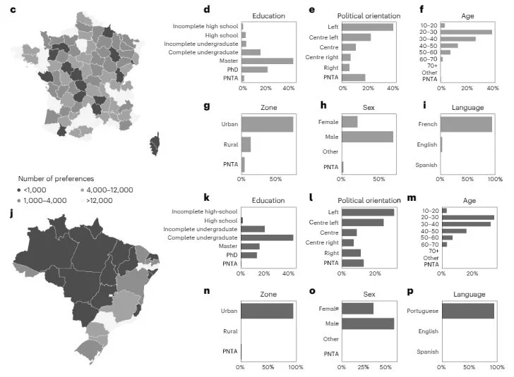
Our research has informed sustainable industrial and economic development strategies, has led to the development of several digital democracy platforms, and has motivated the creation of dozens of public data observatories.
CCL is supported by a European Research Executive Agency (ERA) Chair, and two Horizon consortia projects: the European Lighthouse of AI for Sustainability (ELIAS), and the Observatory for the Sea.

The Observatory of Economic Complexity is a leading international trade data distribution platform. It was begotten at MIT’s Collective Learning group in 2011, and after being open-sourced, it was professionalized at Datawheel (a company that spun out of the CCL in 2013). Today the OEC has dozens of proprietary data pipelines and receives 800k+ monthly users. The CCL is an active partner and collaborator with the OEC. The OEC is updated monthly and has been used by over 5,000 academic publications according to Google Scholar.

Pantheon is an observatory of human collective memory. It contains structured data on the biographies of more than 80k notable individuals. Pantheon was created at MIT’s Collective Learning in 2013. Its current development is now performed by Datawheel. The Center for Collective Learning continues to participate in the Pantheon project by performing academic research on collective memory and by exploring the design of new features that could enhance our understanding of human collective memory.